
Why tiny lettering fails first on the production table
Small text asks a lot from the cutter, the material and the operator. When a job drops below about 6 mm high, even a slight error in blade depth, pinch roller pressure or artwork spacing can turn neat lettering into broken strokes and hard to read shapes.
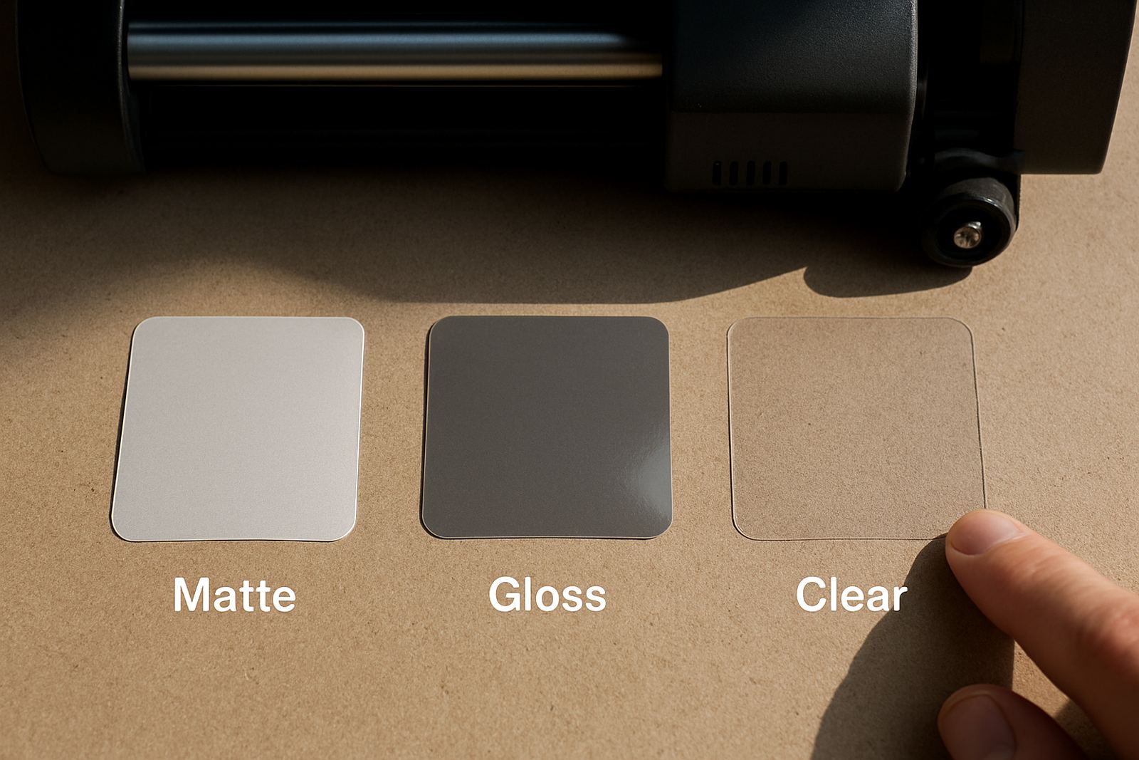
The first problem is not usually the machine. It is the design. Thin fonts, tight counters and packed wording leave very little room for clean separation after cutting. On gloss vinyl, the blade can drag at corners. On matte media, fibres can lift. In winter in Johannesburg and Germiston, static can also make tiny pieces cling where they should not.
If the job is for vehicle graphics, labelling, machine plates or promo items, the client may want small wording, but the cutter still needs a practical minimum line weight. A good rule is to keep detail bold enough to survive weeding with tweezers, not just look fine on a monitor.
Choose type that survives cutting, not just printing
Font choice makes a bigger difference than many people expect. Sans serif faces with even stroke widths usually cut better than decorative scripts. For very small text, avoid extra light weights, condensed styles and characters with tiny inner spaces, because those openings close up fast once the vinyl is cut.
- Use simple letterforms with clear counters, such as a or e that do not collapse at small size.
- Increase tracking slightly so letters do not merge after cutting.
- Convert text to outlines before sending the file, then check every curve and join.
- Keep line thickness consistent across the whole design, especially on multi line copy.
For jobs where the client wants a branded look and the text must stay tiny, it is often better to enlarge the lettering a few millimetres than to force an elegant font to do a job it cannot handle. That small increase can save twenty minutes of rework, or more.
Artwork setup that gives the blade a fair chance
Good small text cutting starts before the media goes into the machine. Cut lines need to be clean, closed and free of duplicate paths. If the artwork has overlapping shapes or stray anchor points, the cutter can pause, snag or leave a rough edge. That is where operators start losing time, and a simple job becomes fiddly real quick.
Keep the design sized exactly as it will be produced, and set enough spacing between repeated labels so the weed area is manageable. If the cutter is doing print-and-cut work, registration marks must be placed where the sensor can read them without confusion. On dark or reflective stock, check the marks before starting the run, because a bad read wastes material fast.
- Remove hidden objects, clipping masks and duplicate cut paths.
- Check that all corners are joined and all shapes are closed.
- Separate tiny text from heavy outlines if the job includes both.
- Use test cuts on the same stock, not on scrap that behaves differently.
Blade pressure, media loading and the small settings that matter
A tiny letter can fail because the blade is a fraction too deep or the pinch rollers are set too tight. On thin self adhesive vinyl, too much pressure can cut into the liner and make weedability worse. Too little pressure leaves uncut bridges that tear when you lift the waste. The sweet spot comes from test cuts and a calm setup, not guesswork.
Media loading also matters. If the roll is pulling at an angle, the cut may look fine on the first few metres and drift on the rest. In Isando, where production teams may run mixed jobs through busy shifts, a quick alignment check before every batch avoids a lot of grief later. That is especially true on long runs for Germiston or Boksburg clients where deadlines are tight and reprints are costly.
Operators should inspect the blade holder, check for debris around the carriage, and confirm that the pressure is suitable for the specific film. A small change in backing paper thickness can alter the cut result enough to matter on lettering under 5 mm.
Weeding tiny text without tearing the detail
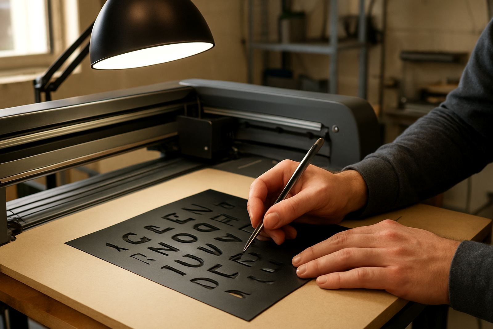
Even when the cut is perfect, weeding can destroy small text if the process is rushed. The goal is to remove waste cleanly while keeping the fine strokes attached to the transfer area. That means good lighting, sharp tools and a steady hand. Heat from a finger or a counter lamp can help on cold mornings, but too much warmth can soften the adhesive and make detail shift.
Use a low angle when lifting waste and work from larger open areas towards the finer sections. If the lettering includes dots over i or j, or small punctuation marks, keep them in place until the main waste is cleared. This prevents tiny parts from lifting with the excess film.
- Weed on a flat surface with bright side lighting.
- Use tweezers or a fine hook for internal spaces.
- Cut the waste into smaller sections on long jobs.
- Apply transfer tape only after confirming every tiny character is clean.
Local conditions that change the result across Gauteng
South African conditions can change a small text job more than people expect. In humid weather near the coast, certain films feel softer and the waste can stretch during weeding. In Gauteng, dry air and static can make narrow lettering cling to the liner or jump onto the tape before you are ready. Power interruptions also interrupt workflow, so machines should resume with settings recorded and a quick test cut after any stoppage.
For a Sandton shop fitting that needs tiny opening hours on a glass panel, or a Midrand label run for equipment casing, the best approach is to match the material to the environment. Some films hold fine detail better than others, and certain adhesives suit indoor short term use while others are better for exposed signage. It is worth matching the job to the site, not only the client brief.
A real example: a Johannesburg installer cutting small compliance wording for industrial cabinets in Isando may need to move from standard text to a slightly larger layout after the first test weed. That one adjustment can turn a frustrating batch into a clean, repeatable production run, and the client usually prefers readable over exact but cramped.
When to stop forcing the cut and change the plan
Sometimes the best production decision is to change the artwork, the material or the application method. If the wording is so small that the counters close up, the letters break on the lift, or the detail takes longer to weed than the job is worth, the design needs review. A signmaker should not have to wrestle every word into place.
There are good alternatives. The text can be enlarged slightly, separated into fewer lines, produced on a different stock, or printed instead of cut if the application allows. For training teams, this is where operator confidence matters. Once the staff know how to judge a job early, they spend less time on rework and more time on clean output.
Small text cutting is less about luck than control. With the right font, setup and weeding method, tiny lettering can stay readable and neat. That is the difference between a job that looks tidy up close and one that starts peeling apart at the edges after installation.