
Start With the Surface, Not the Artwork
Before anyone talks about colours or final artwork, check the actual surface. Painted drywall, sealed plaster, glass, tiles and vinyl flooring all behave differently once a graphic goes up. A smooth interior wall in Sandton will take a very different finish to a textured office passage in Germiston, and that affects what can be printed, cut and installed.
For wall graphics, ask whether the paint has cured properly. Fresh paint can still release moisture and that weakens adhesion. On glass, look for tint, frosting, silica coating or security film already in place. On floors, confirm whether the area gets mopped with strong cleaners or exposed to trolley traffic, because that changes the material choice. If the building is in a coastal or humid area, even indoor spaces can hold more moisture than expected and the edge lift risk goes up, especially near entrances.
A clean surface is only half the story. The other half is access. If the wall is above reception seating or near a staircase, installers need enough working room and a safe way to position ladders or lifting equipment. That should be checked early, not on the morning of install.
Match the Graphic to the Job It Must Do
Indoor graphics are usually asked to do one of three jobs: guide, promote, or decorate. A wayfinding arrow in a hospital corridor must be legible at speed. A seasonal promotion on a shop window in Midrand has to catch attention from outside. A branded feature wall in an office should look neat from close range and hold up under daily cleaning.
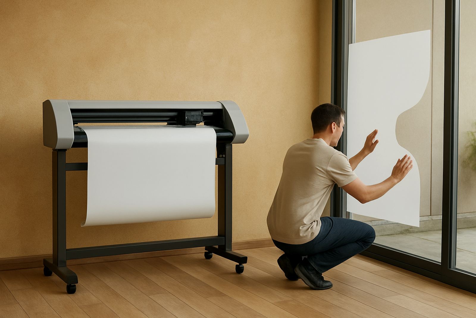
Once the job is clear, the format becomes easier to plan. Wall text can be cut from solid colour material or printed for more detail. Window graphics may need one-way visibility, clear areas for light, or perforated film if the inside view matters. Floor graphics must use slip-rated material and a protective laminate suitable for foot traffic. Not every design needs to be loud, and in many buildings a calmer layout works better.
- Choose larger lettering for corridors, entrances and reception areas.
- Use higher contrast for low light spaces and long reading distances.
- Keep key information above furniture, doors and skirting lines.
- Allow for fire notices, emergency signage and access panels.
Measure for Real Life, Not Just for the Drawing
One of the most common mistakes is measuring only the open area and forgetting the interruptions. Light switches, plugs, alarm sensors, aircon vents, glass joints and dado rails all affect layout. In a retail store, a graphic can look perfect on paper and still clash with shelving or payment points once installed.
Measure the full height and width, then mark what must stay visible. For windows, record the exact glass size, frame width and any film already fitted. For floor graphics, note where people turn, slow down or queue. A floor arrow placed in the wrong spot becomes a tripping concern or gets ignored entirely. It is also worth checking whether the graphic needs to be read from one side only or from both sides, because that changes the file setup and the material spec.
When the building has several branches, ask each site to send a clear photo with a tape measure in shot. It sounds simple, but it saves time and prevents costly reprints. A small measurement error on a 3 metre wall can throw off the whole layout.
Prepare Files for Clean Cutting and Clear Installation
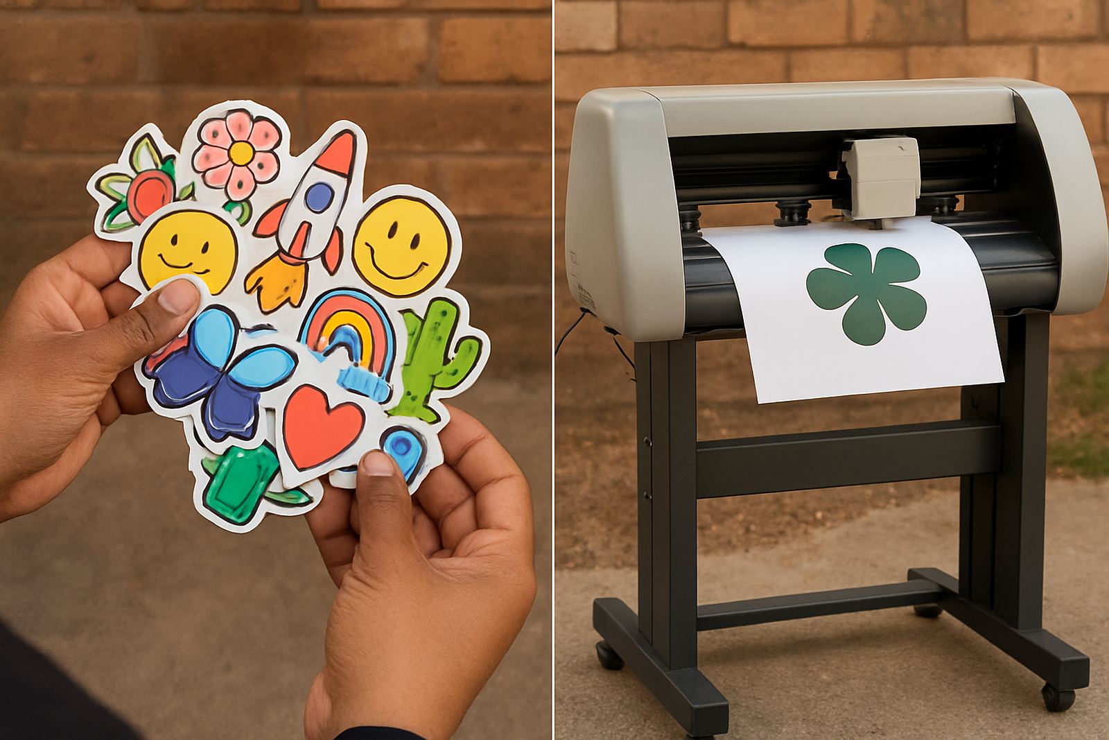
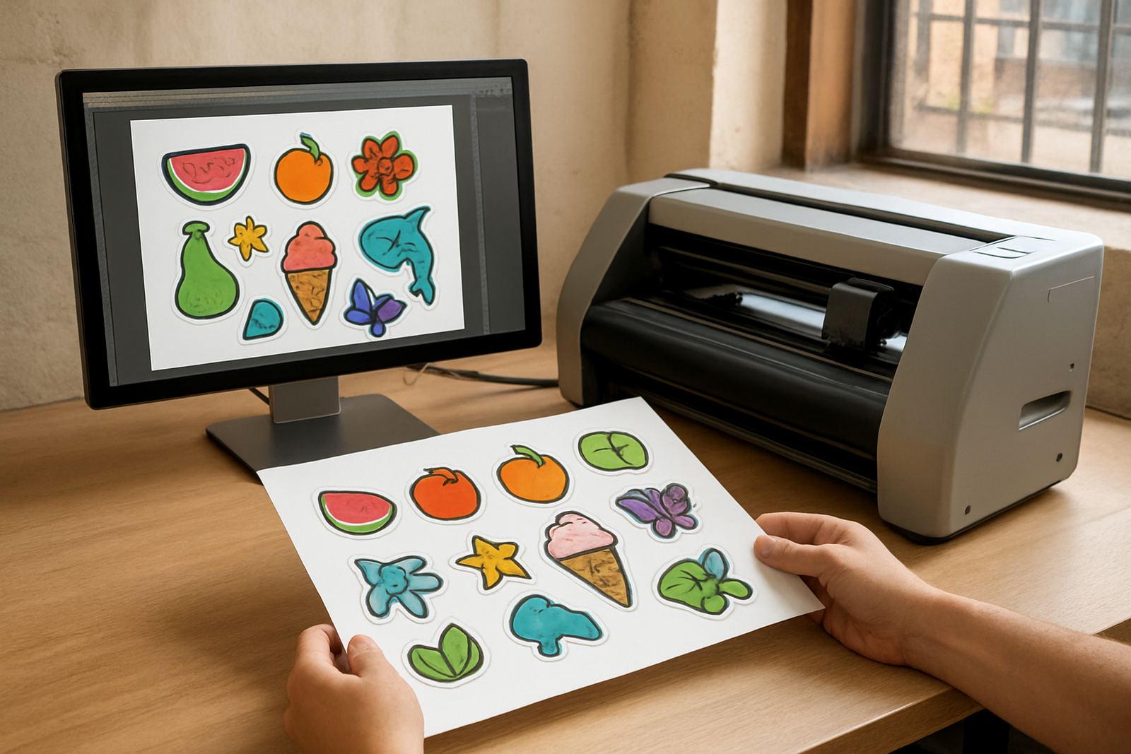
Indoor graphics often mix print and cut work, so the file setup must be accurate. Artwork should be supplied at the correct size, with clean cut lines, proper registration marks and enough bleed where print edges are expected. Fine detail is possible, but tiny gaps and hairline elements may not survive on busy walls or textured glass.
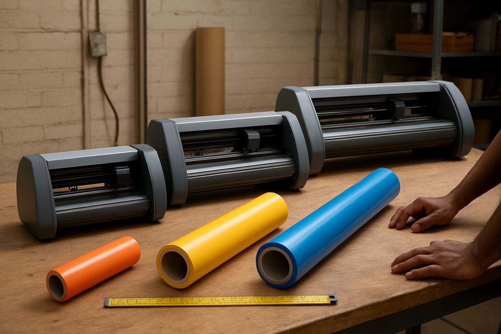
For text-heavy designs, check spelling, spacing and line breaks carefully. A single character can move the balance of a whole message, and on a reception wall that is hard to ignore. If the design includes small icons or repeated shapes, keep stroke weights sensible so the cutter can track them cleanly. In production, media loading and blade pressure setup matter as much as the artwork itself.
- Use vector cut paths wherever possible.
- Separate print layers from cut layers clearly.
- Keep small text away from busy backgrounds.
- Allow room for installer trim and overlap at joins.
If a project has a lot of panel joins or repeated sections, ask for a production mock-up with panel numbering. It makes installation faster and reduces mistakes on site.
Think About Cleaning, Light and Daily Wear
Indoor graphics are usually expected to last longer than people think. Reception walls get fingerprints, corridor graphics get bumped by trolleys, and window decals collect dust at the edges. In buildings that run on tight schedules, maintenance matters as much as appearance.
Ask what cleaning products will be used. Some vinyl surfaces handle mild detergent and a soft cloth well, but aggressive solvents can dull the finish or lift edges. Floor graphics need regular checking in high-traffic areas, especially at retail entrances and lifts. If a building runs on backup power during load-shedding, lighting levels can change and low-contrast graphics may disappear more quickly than expected. That is one reason good planning beats fixing problems later.
For sunny window fronts in Johannesburg, UV exposure still matters indoors. Heat build-up through glass can affect adhesive life and fade rates, especially on west-facing areas. A practical spec from the start saves replacement costs and keeps the site looking tidy for longer.
A Local Example From Isando to Sandton
Consider a business park project with a reception wall in Isando, a glass meeting room in Sandton and directional floor graphics at an entrance lobby. Each area needs a different approach, even though the brand message stays the same. The reception wall can carry a bold logo and a short statement. The glass room may need privacy bands plus smaller branding elements. The entrance floor should use short, direct arrows that guide visitors without clutter.
On a project like this, the sequence matters. Site survey first, then artwork checks, then material selection, then a production schedule that fits the building's access times. If the site only allows installation after office hours or over a weekend, that should be built into the plan early. In busy commercial areas around Boksburg, Randburg or Midrand, delivery timing can also be affected by traffic and security access windows, so the job sheet must be clear.
The best results come when the person planning the graphics understands the building, the message and the installation conditions. That is what keeps a project clean, practical and worth the spend.